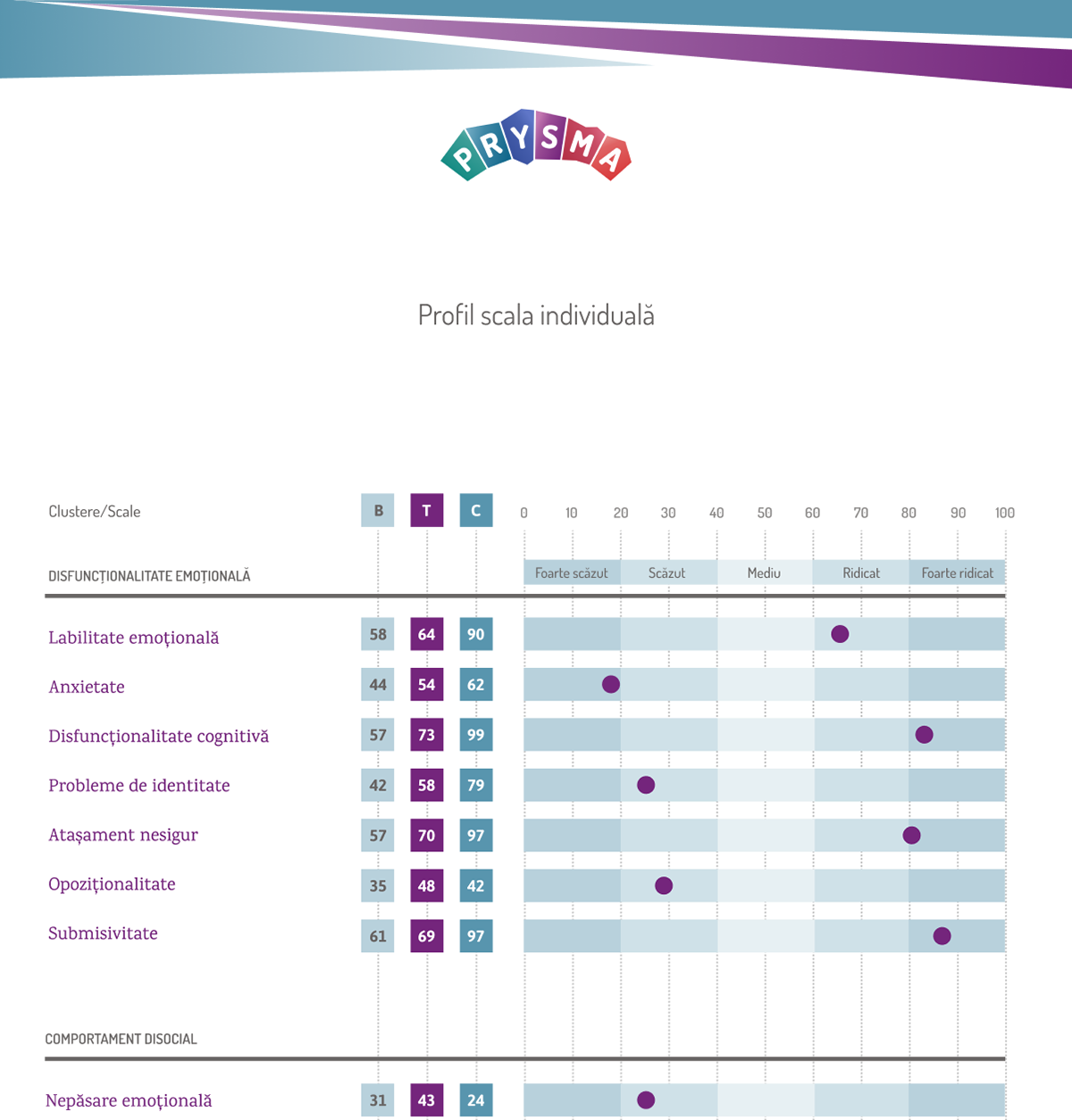
Prysma is a system of in-depth psychological evaluations, residing on an exclusively online platform. Made-up of sets of tests, it will measure results on different scales, and assist psychologists in assessing specific areas of interest based on each client's needs.
Prysma standalonne symbol & favicon
We wanted to have a powerful logo, that would work very well regardless of the layout in which it is positioned. The fact that the results of the tests are generated online created the need for a logo that is not very sensible to positioning and aligning.
The logo was built with the font that is used throughout the platform, thus creating a unitary and refined overall look.
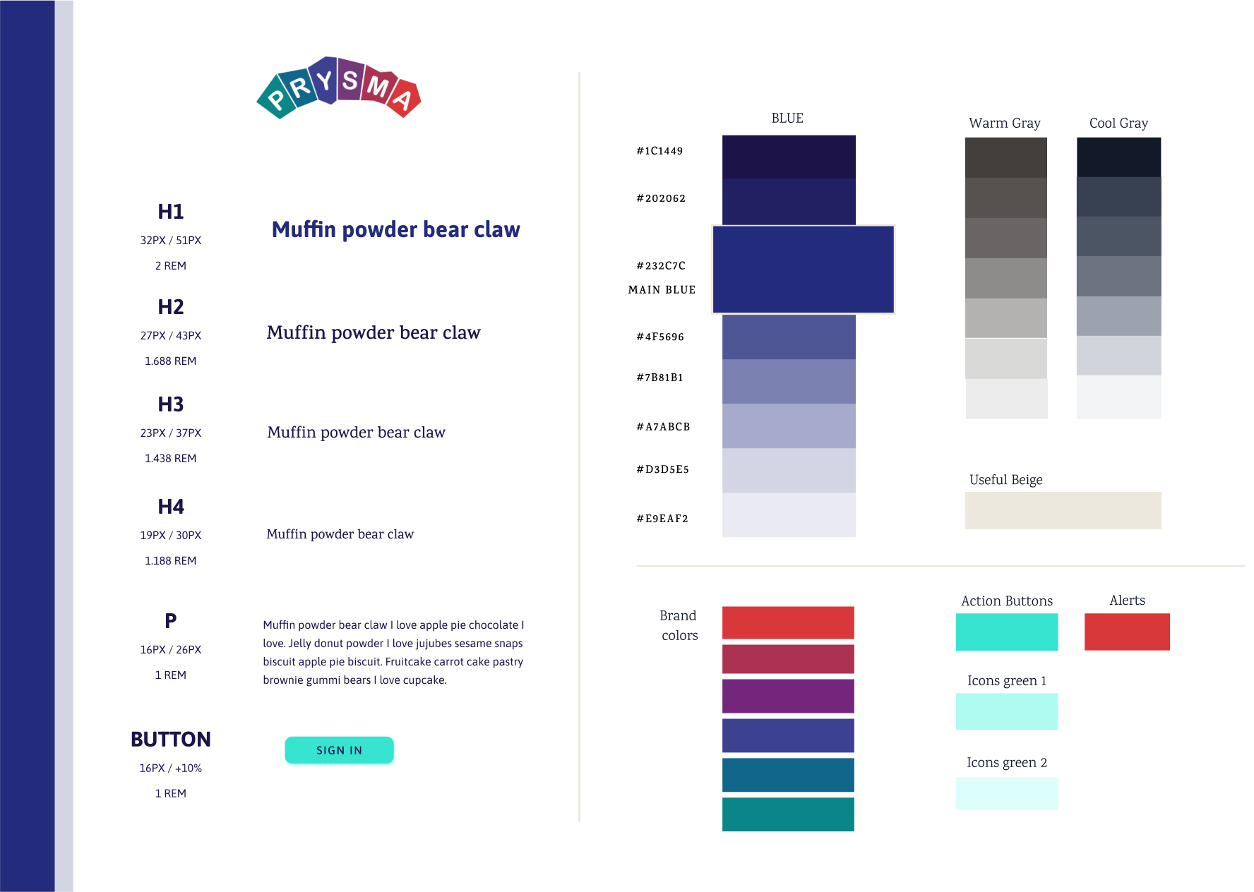
I proposed a solution that would allow for and effortless diffusion of the brand visual identity across all documents, and also allow for helpful color-coding of the different segments of the system.
Interpreting the concept of a Prysm that separates light into its constituent colors, we created the logo in angular shapes, with a vertical variation and also with assorted graphical elements that would complete the visual identity.