The initial Jolidon logo, still beautiful as a label but otherwise rather difficult to use was becoming obsolete. In the case of the shops' branding, different solutions coexisted, diluting the corporate image.
Initial situation
The old green Jolidon logo was becoming obsolete, a new logo was needed, to better communicate the company's values and to better adapt to different media. The green logo was particularly difficult to work with in the process of branding the Jolidon retail chain store, that was exploding at the time, both in Romania and abroad. In some cases the designers abandoned the green logo and instead used a Zurich font to write the company name, thus diluting the corporate image.
The brief I was given was minimal, the logo needed to work well on all the media and to reflect the higher repositioning of the brand.
Approach & solution
Without many specific requirements in the brief, I had to take a rather intuitive approach. For more than a decade, the main channel of communication between the brand and the consumers was the product itself. The reputation of the name was immense in Romania, and quite big in the international lingerie world. The range of Jolidon products was very big, developped to address a wide variety of consumers, males and females of all ages.
With this diffuse yet strong positioning the obvious choice for me was to stress the importance of the name itself. I chose to draw a highly legible and visually strong logo (which, unsurprising, is the choice of most of the big names in fashion industry). I also felt the need to design the logo with a fashion umbrella brand in my mind. As the company was going through a time of massive expansion, the brand name could really be seen and treated as an umbrella brand, this allowing for later development of other lines of related products under the Jolidon name. The international list of lingerie brands who successfully developed related lines of products is big.
The name itself was a very fortunate one and I worked on it, rejecting all suggestions of associating it some icon, as I felt that anything foreign to the name itself would bring no further value and would be difficult to integrate consistently.
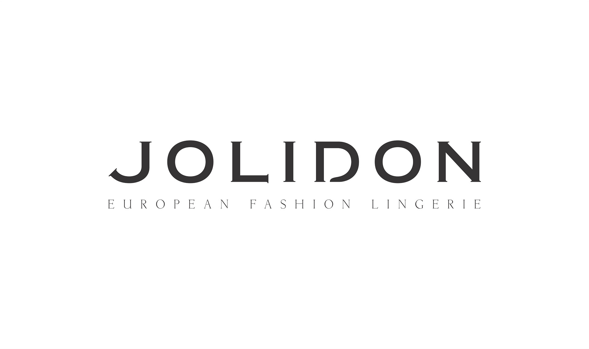
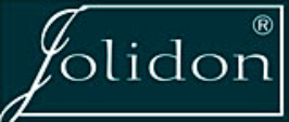
The end result was a clean logo built on a modified Copperplate Gothic font, a subtle and classic serif, with a slight nautical look. The logo is still in use today, in many associations with other graphic elements in order to represent Jolidon sub-brands that have since then been developed.

The JD Monogram
The idea of a monogram came to me from the beginning. Reinforcing the name, whilst being a separate icon that is to be used for a multitude of purposes. Most of the big fashion names had it, and if they didn't they usually tried to come up with one.
Now. How do you create a monogram for a single word name?
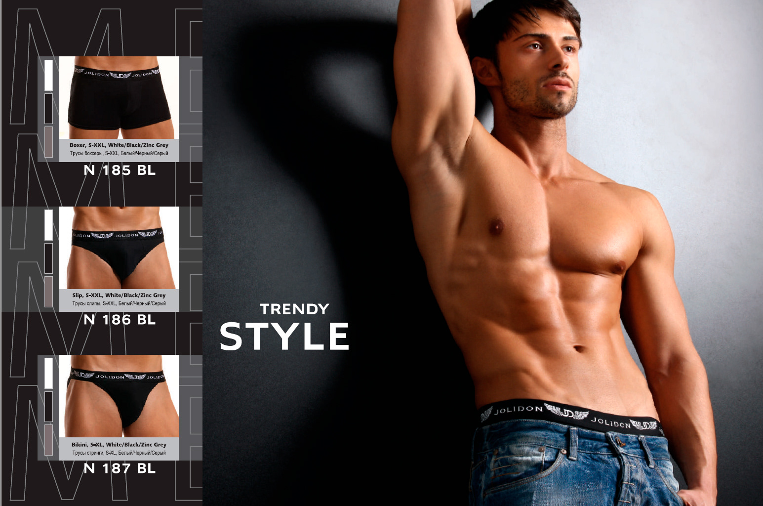
After plying for a while with double 'J's, without much satisfaction, I went back to the name. Jolidon. Fortunate it was, also because in French and Italian, both highly relevant in the fashion world, the connotations are very good. If you have to split it, you would split it into 'joli' and 'don'. So I did. The monogram is still in use as a decorative sign, especially on the male segment of products.
Now. How do you create a monogram for a single word name?
After plying for a while with double 'J's, without much satisfaction, I went back to the name. Jolidon. Fortunate it was, also because in French and Italian, both highly relevant in the fashion world, the connotations are very good. If you have to split it, you would split it into 'joli' and 'don'. So I did. The monogram is still in use as a decorative sign, especially on the male segment of products.
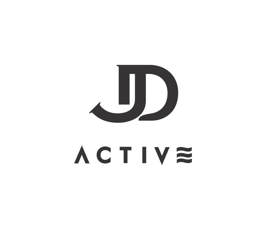
JD Active - a logo used on the sports swimwear range of products.

Paper bag for the Jolidon stores.