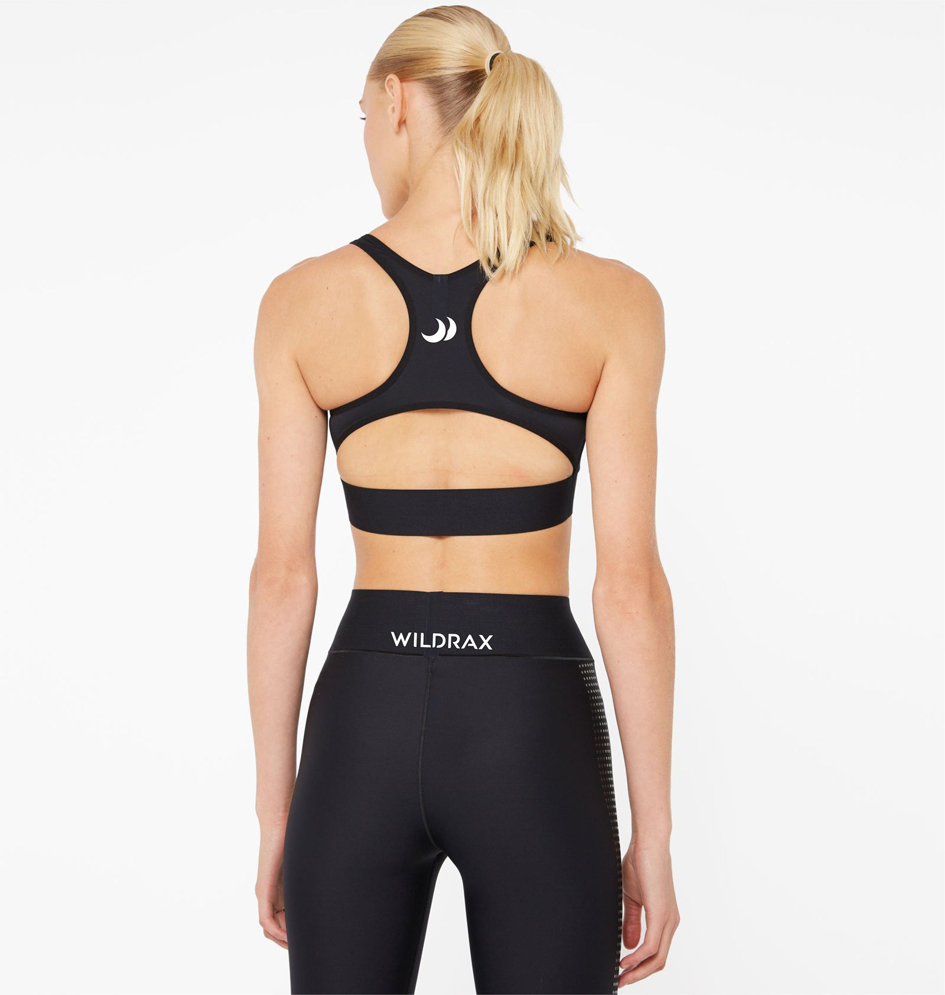
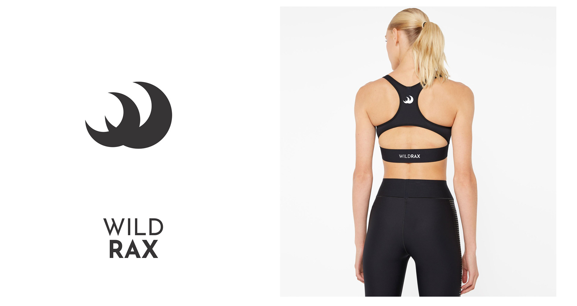
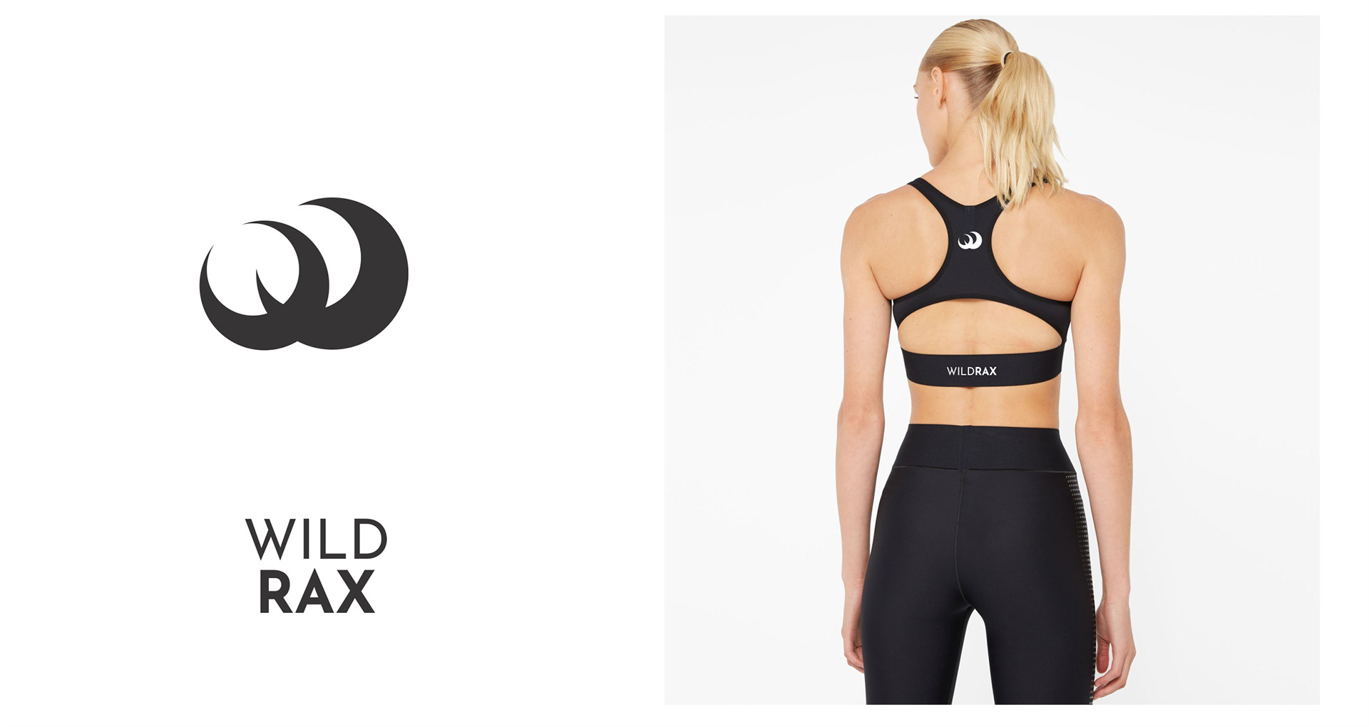
WILDRAX is a Downtown LA based American luxury sports bra brand that effortlessly combines luxury and cutting edge style for active women wearing D+ cup sizes.
I created the visual system for the brand, based on the input from the brand designer and with market positioning and customer profile in mind. We wanted to adhere to the best practices in fashion industry visual identity, creating a system that would work very well both in online and print, and really great when imprinted on textile materials, on the final product.
We wanted an iconic symbol that would differentiate and elevate the product and spared no efforts in the search for the best solution.
The brand name has a playful connotation, as racks may mean breasts in slang. Due to difficulties in registering the simple name Rax, the WildRax term was created, and thus the name came to convey also the wild, close to nature, untamed character of the woman that the brand is designed for.
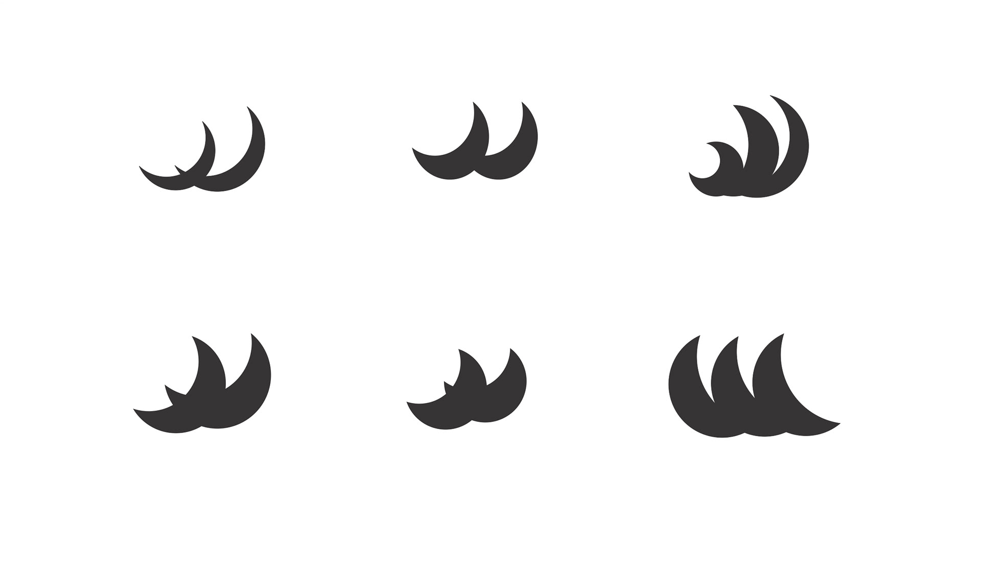
I drew numerous ideas of symbols that would be feminine but wild, iconic on a piece of activewear.
In the process the idea of moons that could also look like waves that could also look like breasts but could also be seen as a stylized W grew more and more powerful and it was in the end the solution that we refined and perfected.
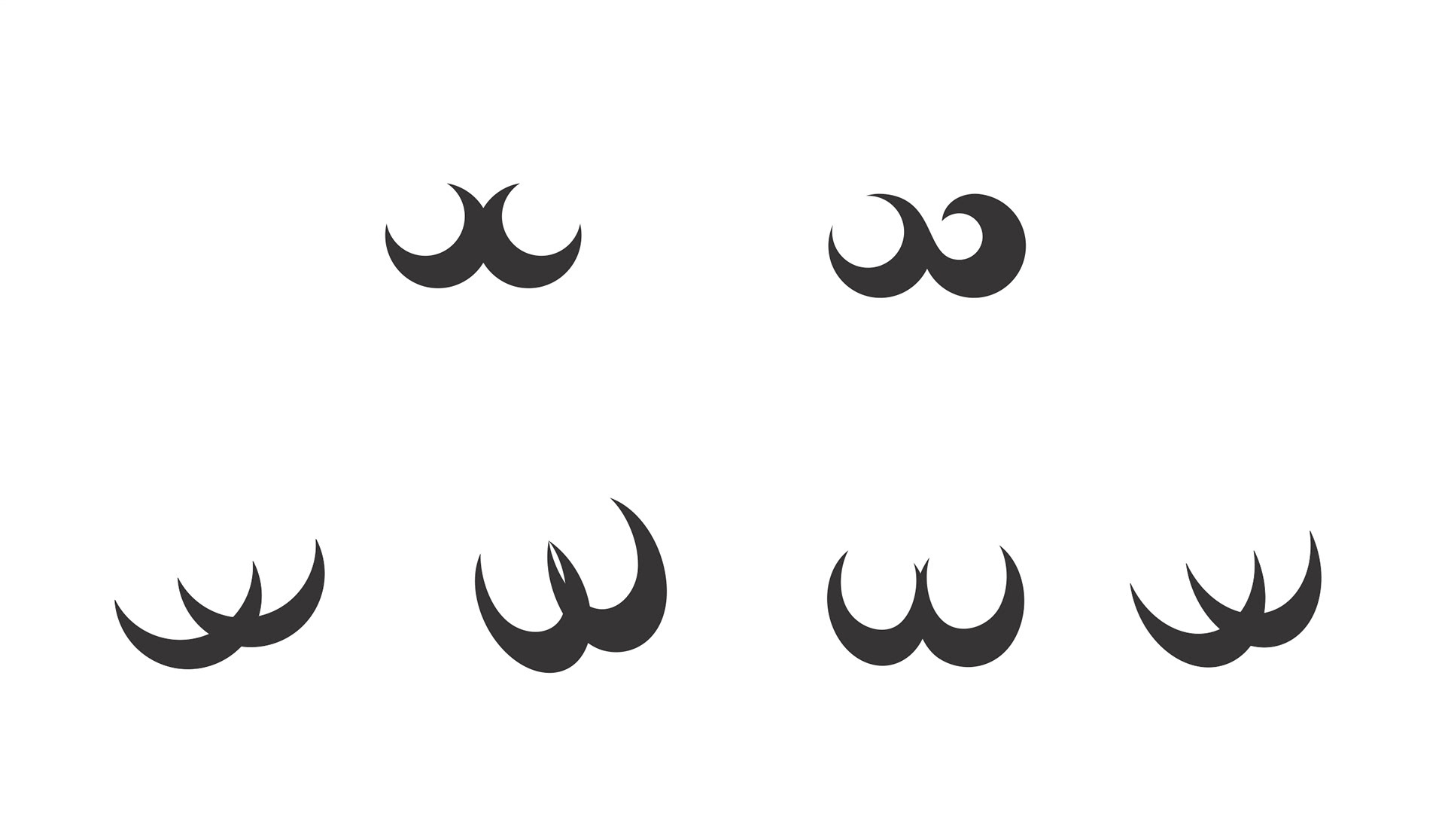
Many variations of the initial concepts were drawn in search for the perfect solution.
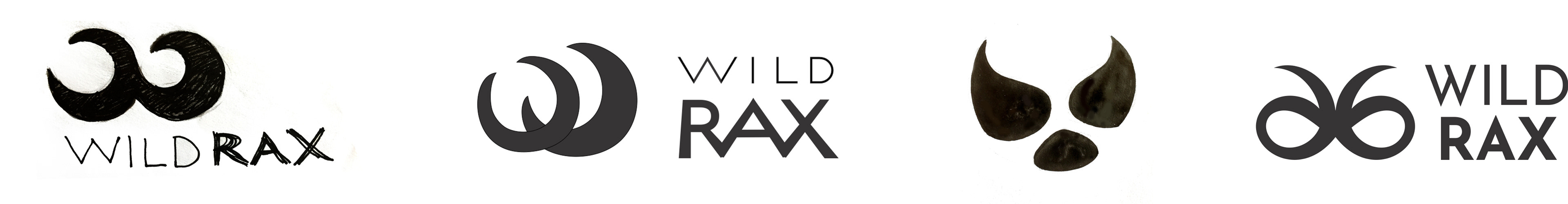
The final set of elements contains 3 logo variations, and the option of the icon used alone, in order to address the many types of logo use that arise in fashion items design.

product labels different sizes and types