Initial situation
In January 2012 I met a visionary entrepreneur with a big dream: to build an up market, internationally appealing brand for the cold pressed oils that her parents' small family business were producing at the time.
The oil was sold at the time under the name LUNA, which is also the name of the Transylvanian village where the oils were being produced.
Brief
The brand owner had in mind an upscale product that would appeal to consumers both on internal and external markets.
The brand owner had in mind an upscale product that would appeal to consumers both on internal and external markets.
Approach & solution
Not knowing on what markets the product will go, I tried to create a personality that would appeal universally, if such a thing is ever possible.
I was lucky that the initial name under which the oils were sold was 'Luna', meaning 'moon' in Romanian. I continued that story. With a health conscious, educated consumer in mind, I worked on an equilibrium/yin-yang kind of story.
The moon/sun symbol that became the logo is appealing and simple to understand, and the name I did research and settle for reads well in many western languages.
The overall image was kept clean and sometimes a bit artsy, and there are two slogans/taglines in use:
"Moon. Sun. Equilibrium", and "Luna Solai. Cold pressed oil. Suits your healthy lifestyle'
Reception
The brand did indeed appeal to the targeted audience, and it was very well received by the public. The fact that Luna Solai is liked and understood on some external markets with very different cultures (Asian, Arab) is proof that the bet on creating a universally appealing brand from a story that began in a village in the heart of Transylvania was an inspired one.
The brand did indeed appeal to the targeted audience, and it was very well received by the public. The fact that Luna Solai is liked and understood on some external markets with very different cultures (Asian, Arab) is proof that the bet on creating a universally appealing brand from a story that began in a village in the heart of Transylvania was an inspired one.
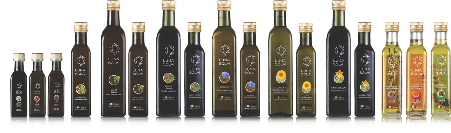
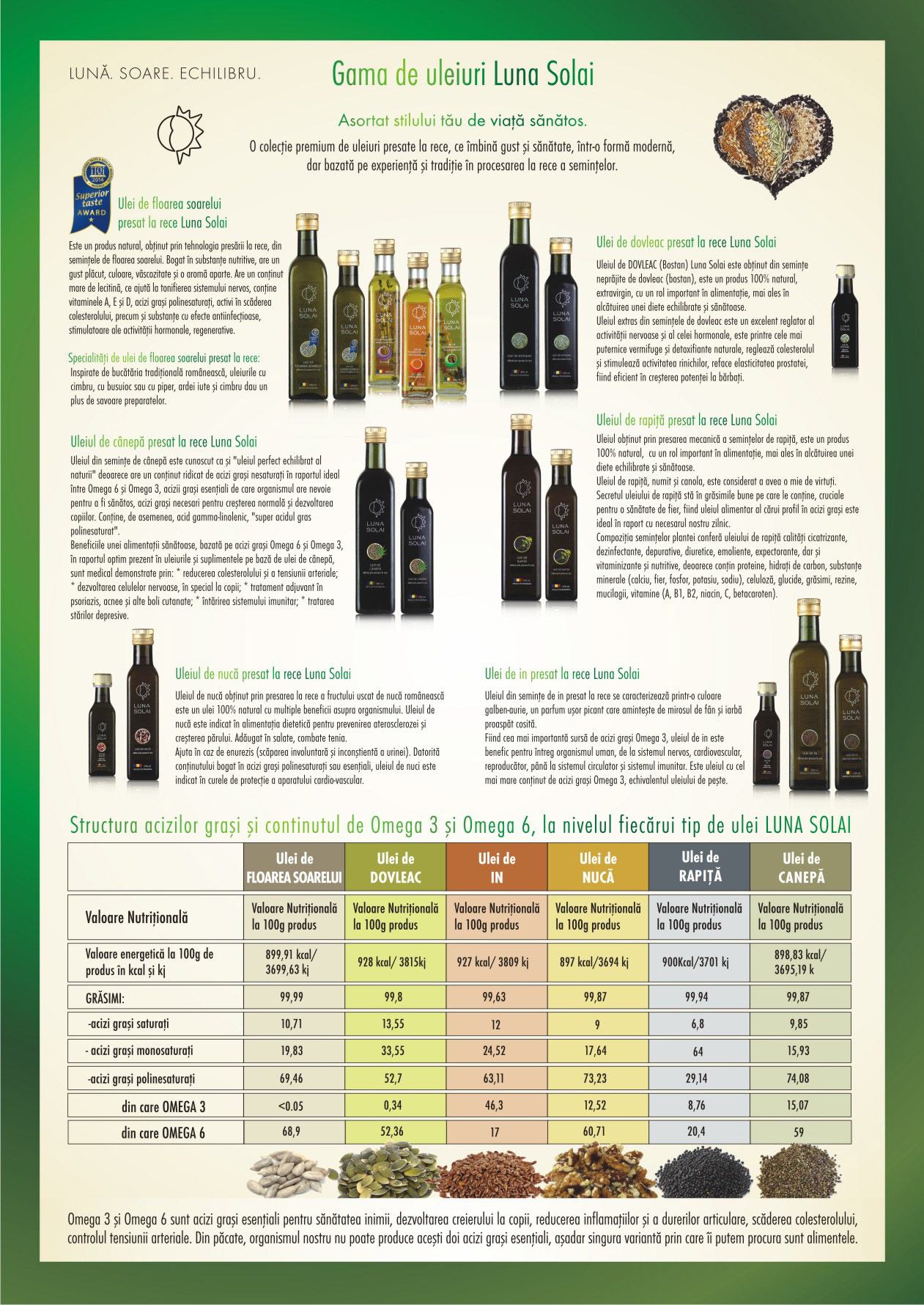
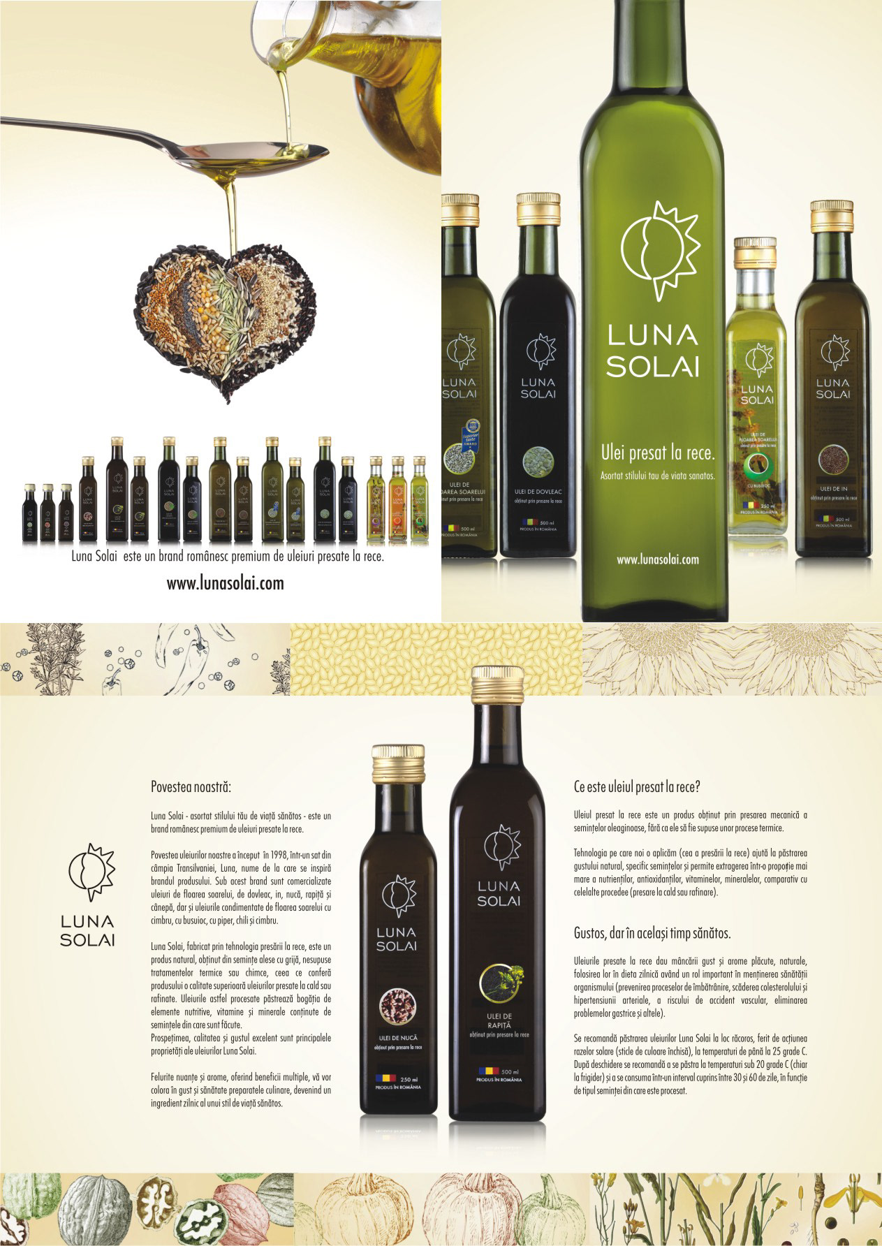
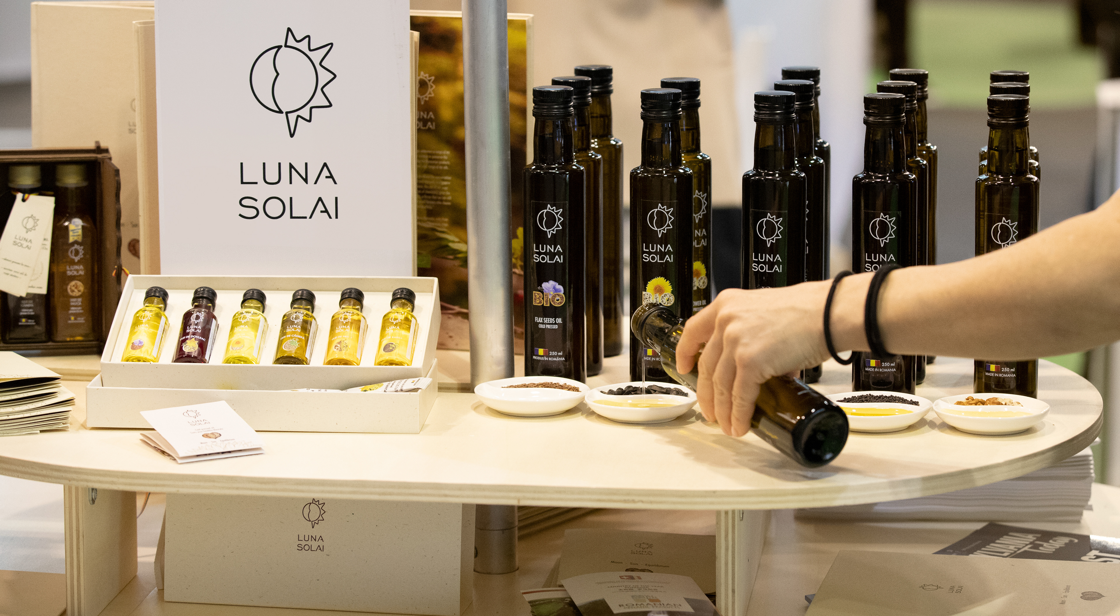
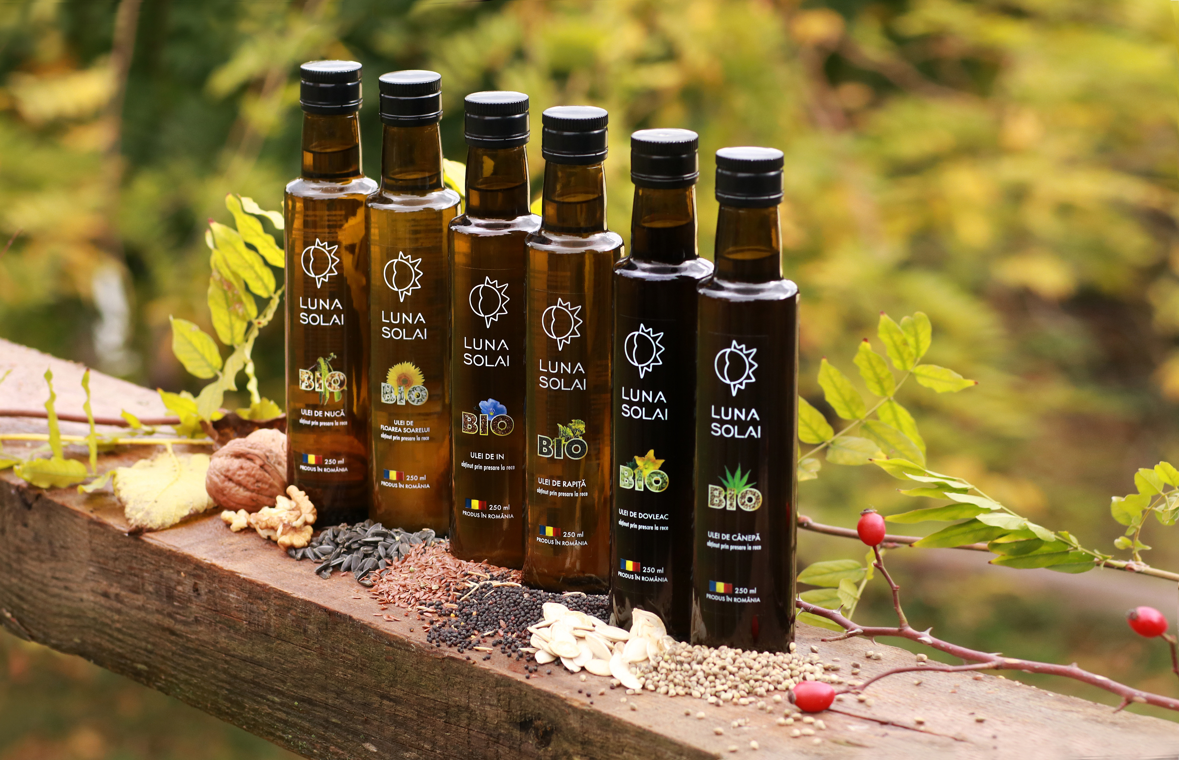
The product range for the Luna Solai oils, label design.
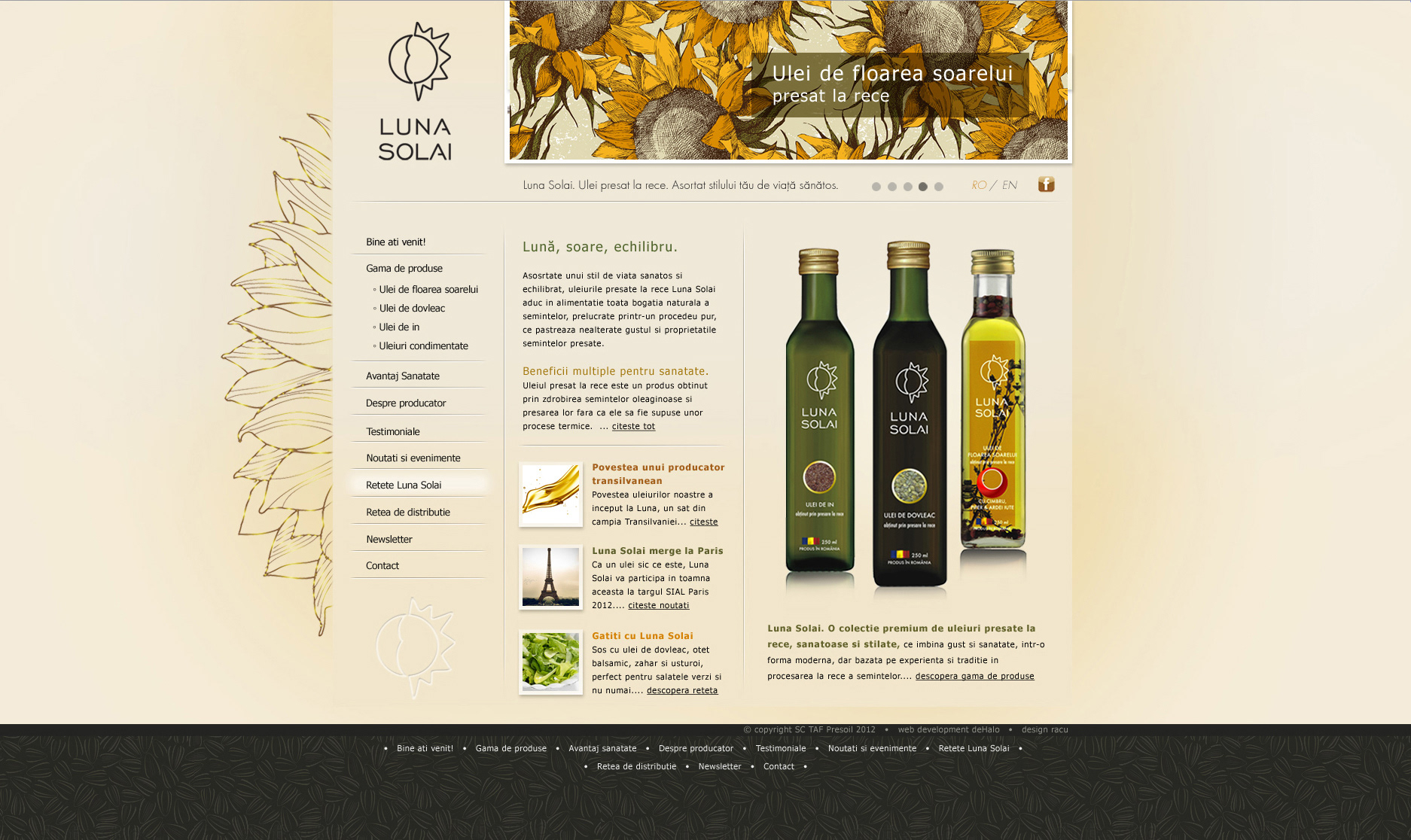
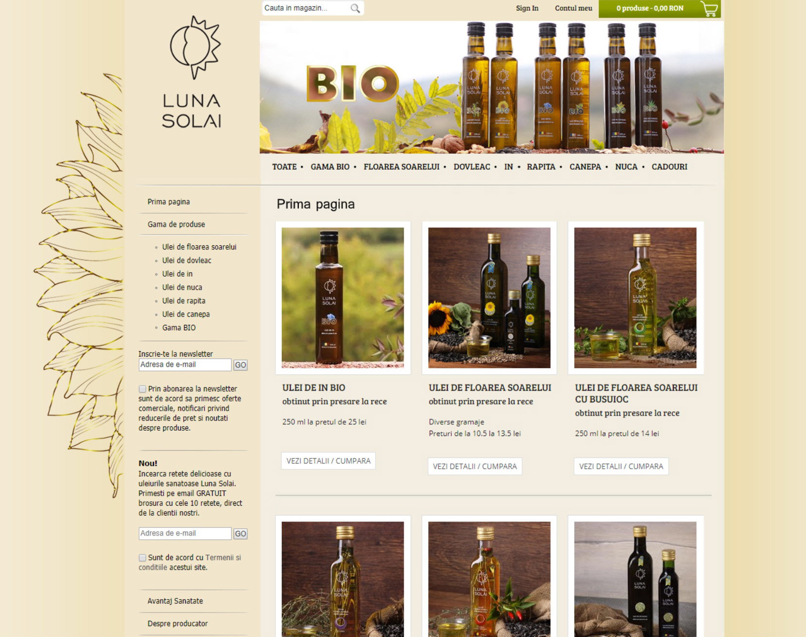
The 2012 website for Luna Solai, it received in 2014 the online shop addition.
In 2015 the BIO segment of Luna Solai was launched. As the brand had already gained a lot of popularity, having also become an official Purveyor of the Royal House of Romania, we wanted to keep the new bottle looking very much similar. We used a slightly modified design for the label, signaling the BIO quality, using a round bottle to differentiate, and kept the product recognizable by the consumers who already loved Luna Solai.
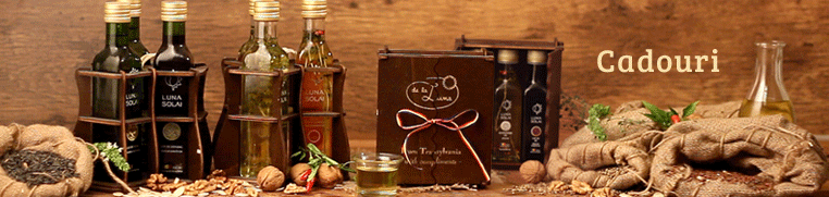
Cinemagraph made for the "gift' section of the Luna Solai online shop.
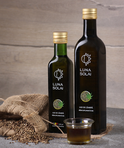
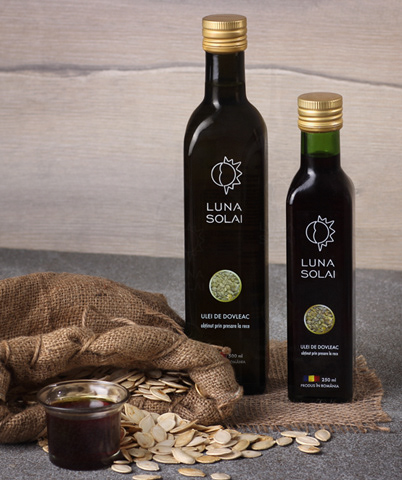
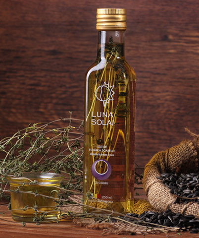
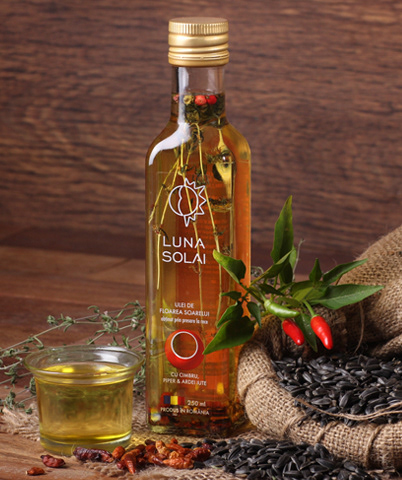

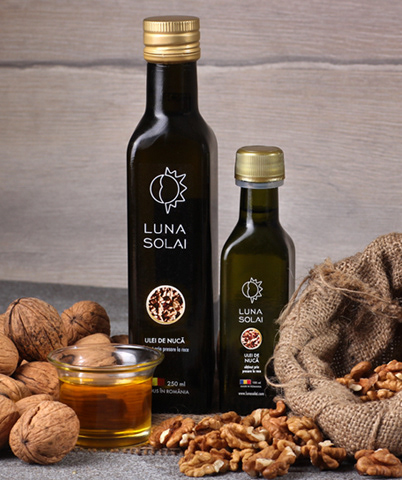


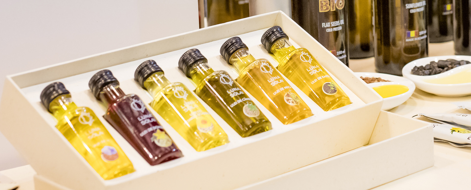
The photo styling for the oils used a natural theme, with natural materials, seeds and the oil in a glass container for an accurate view on the product's exquisite quality.