cinemagraph made for the website's homepage

Back in 2015, Spyhce, a young company specialized in Python software development needed a website to show to the world. It had two separate categories of users, with different requirements. The website needed to show a professional, tech-savvy side to the clients and potential clients, but also show a fun side and look appealing to young talent that might have been interested in joining the team. The visual solution adopted for the Sphyce website was to use a modular grid, with the possibility for quick adaptation and modification. A creative hour widget was designed for use in the contact page.
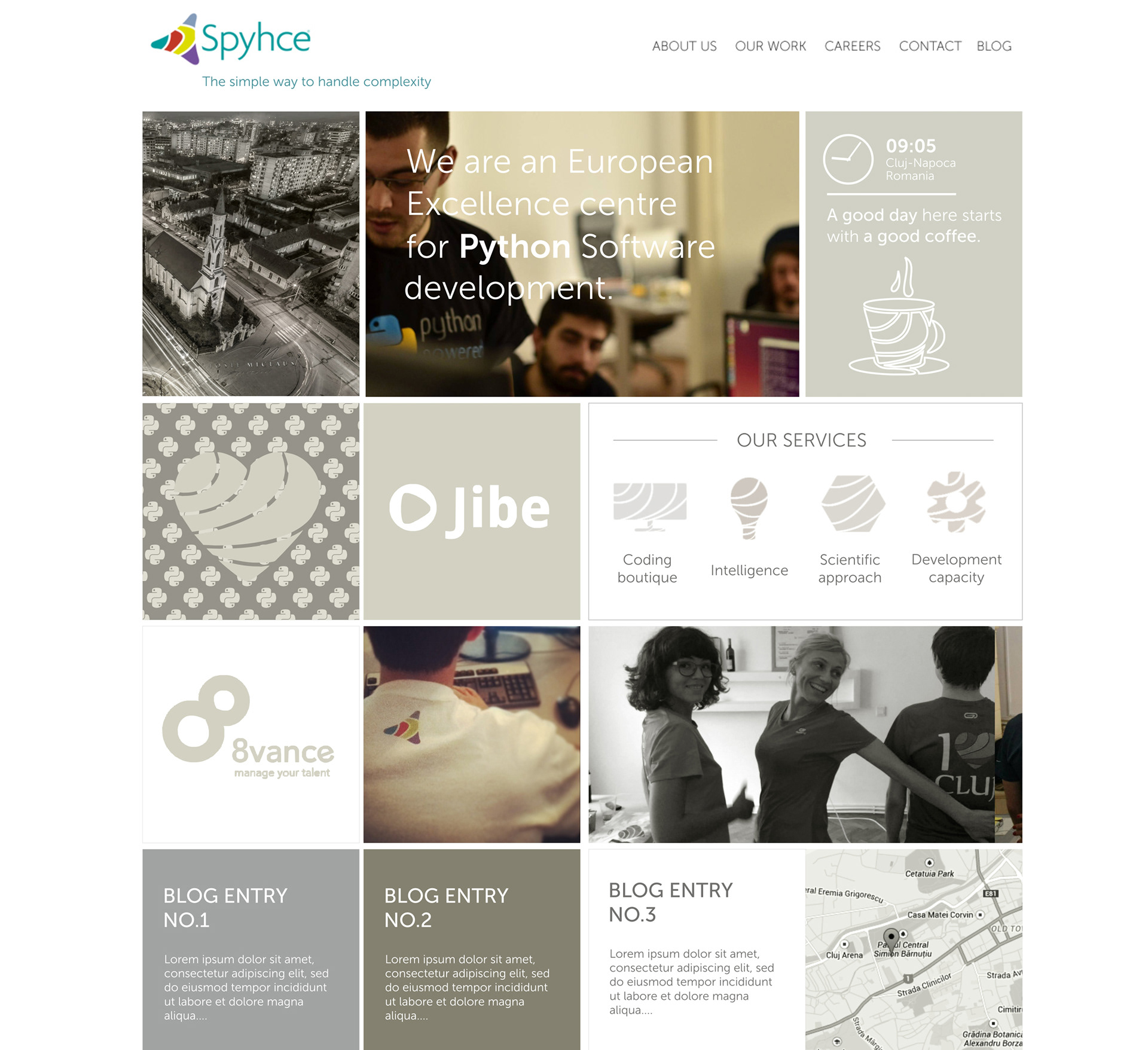


I designed a set of custom illustrations for use throughout the Spyhce's visual communication, using the logo's visual style and colors to interpret different IT related symbols.


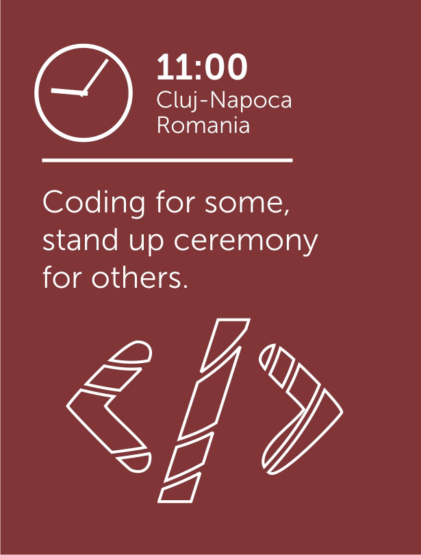
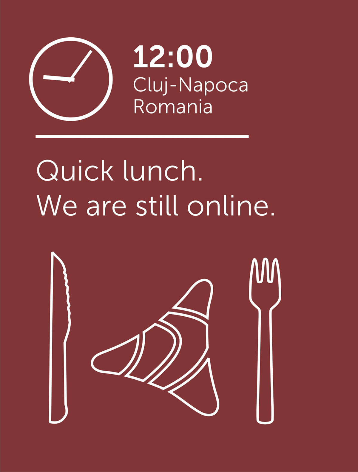
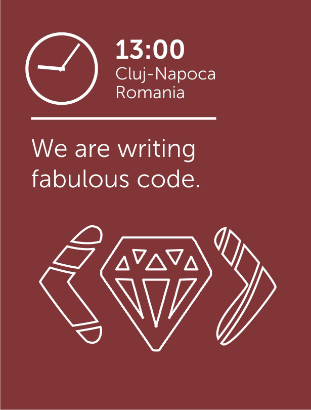
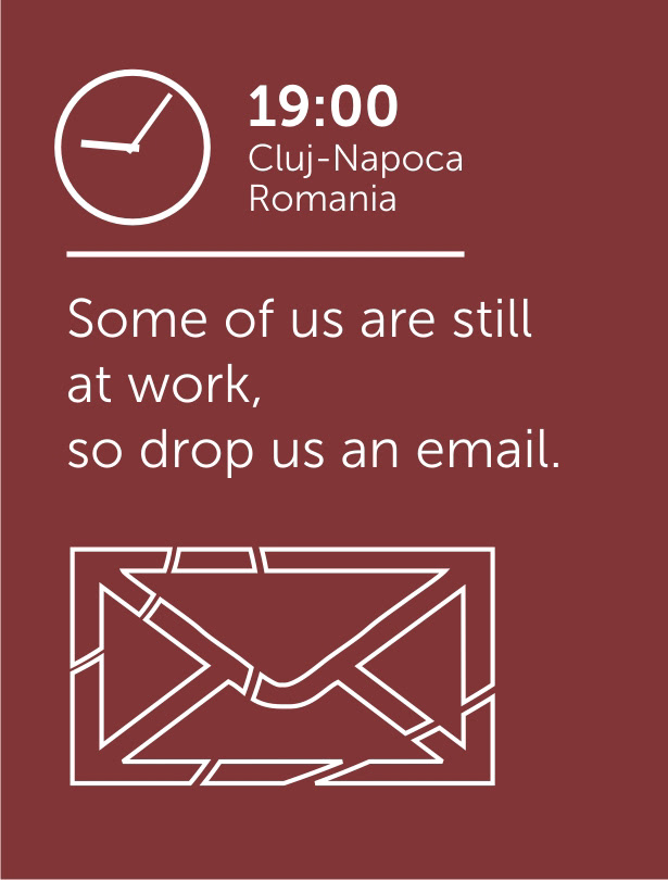
Spyhce website hourly widget
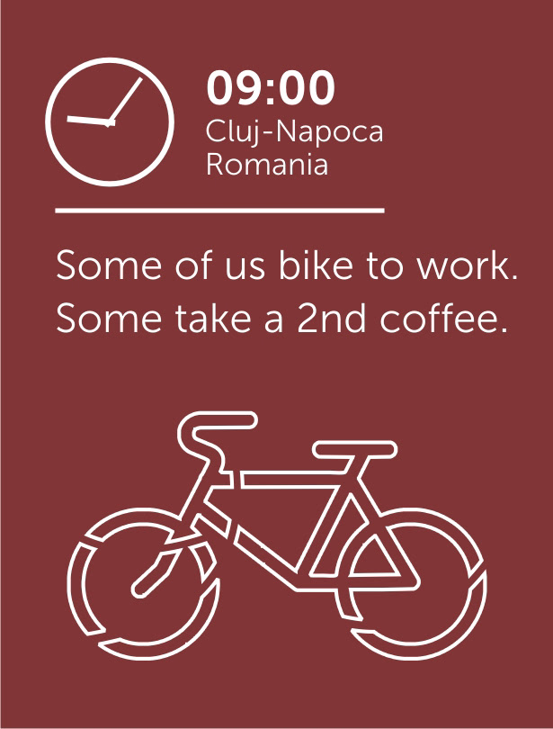
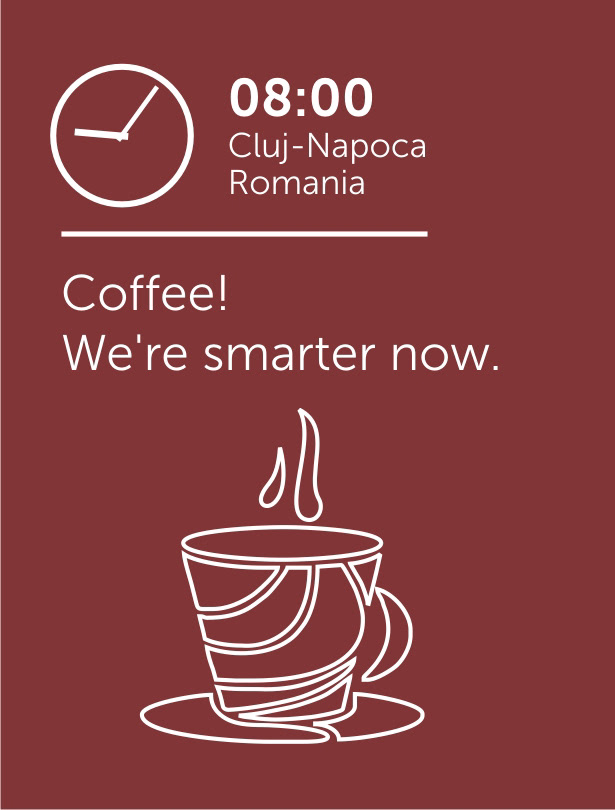
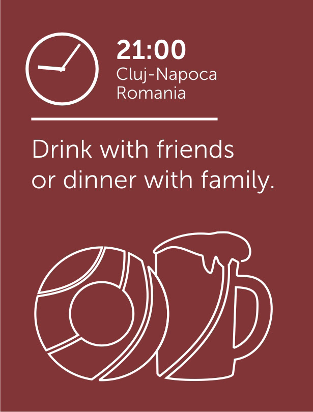
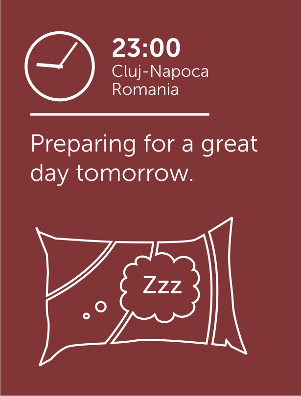
Of the brief requirements, there was one which had more creative potential: with customers located in different parts of the world, it might have been relevant for them to instantly know what the local time is at the Spyhce offices. So we put up this idea of a playfully illustrated widget, which would inform visitors of the local timing. Creative copywriting & illustration (custom illustration used the Spyhce logo style and brand colors).


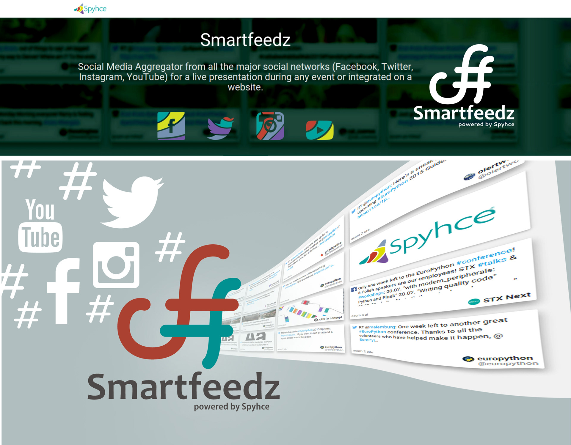
Smartfeedz is a Social Media aggregator that aims to collect Social Media messages from several different sources and present them live during an event.
All Social Media posts with #event are scrapped and highlighted using one single "wall" full of opinions, pictures and feedback, as your conference/festival events are rolling and guests/participants are interacting via Twitter, Facebook, Instagram, YouTube.
All Social Media posts with #event are scrapped and highlighted using one single "wall" full of opinions, pictures and feedback, as your conference/festival events are rolling and guests/participants are interacting via Twitter, Facebook, Instagram, YouTube.
The logo I designed for the Smartfeedz product aimed for a musical quality and is basically a stylized hashtag made of the letters "S" & "f".