Specialized in services for power and automation, Enevo Group delivers energy solutions for a wide range of clients. Sometimes one client is overseeing dozens of solar power systems at the same time, and this was done via a desktop app. My task was to design a mobile app that will take the most relevant of the data about this systems and present it to the user in a clean, digestible way.
I used Figma as a tool and it offered great communication functions and allowed us as a team to easily communicate directly on the design file during the entire design process.

Problem statement
We identified two types of user, one would be an employee of a company owning several power systems at different locations, and another type, just a person who has a solar system installed at their residence. The app needed to be simple enough, for the one-location user, but also offer functionality and detail needed by the specialized user who has to monitor multiple locations.
The problem statement was defined as this:
User is a person monitoring one or several Enevo solar systems who needs an easy, mobile way to monitor the status of their solar energy equipment because they want to know how the systems are performing at any time, wherever they are.
The backend system behind being in place, the main objective was to choose the most important data and structure it in a digestible form, for the mobile app.
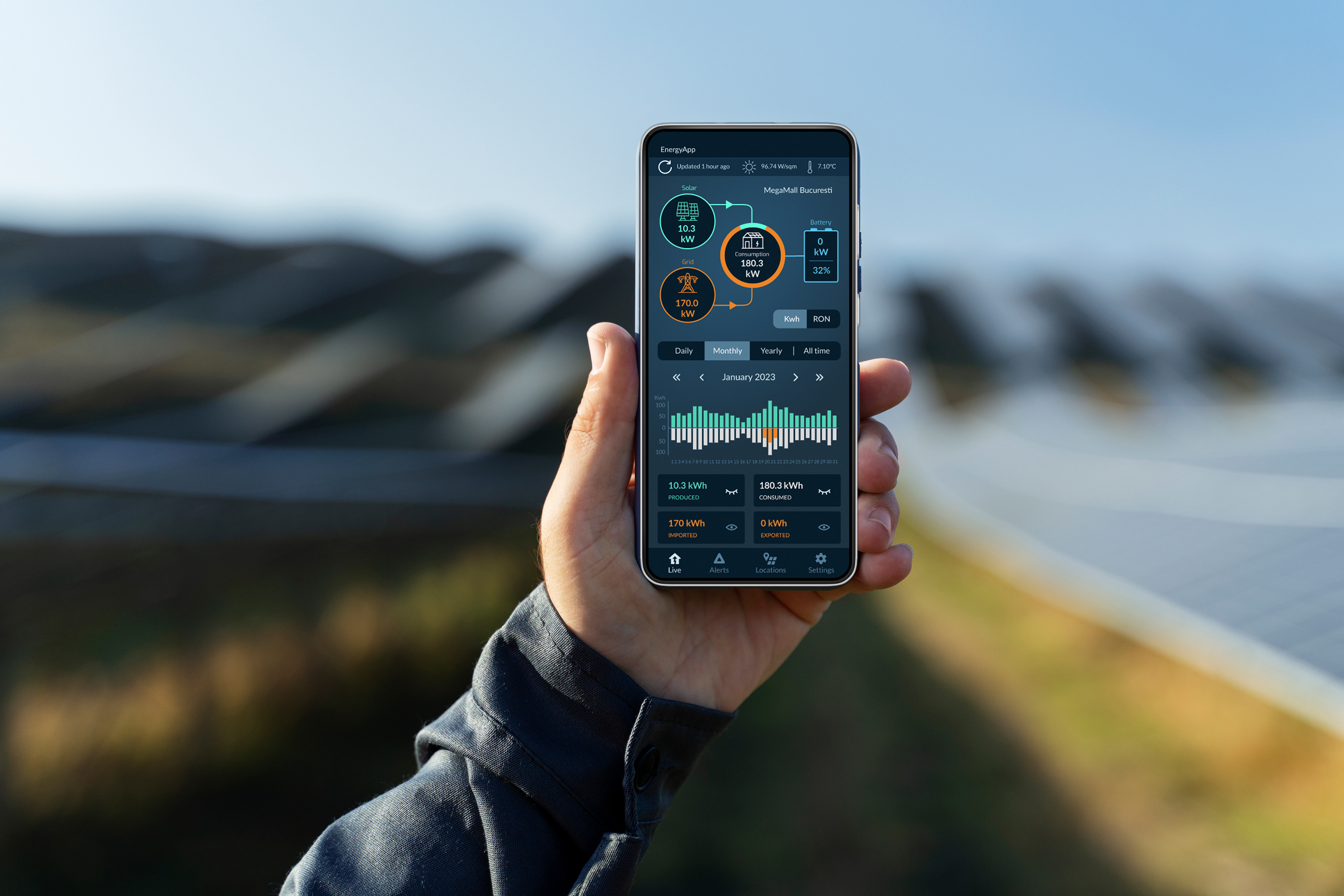
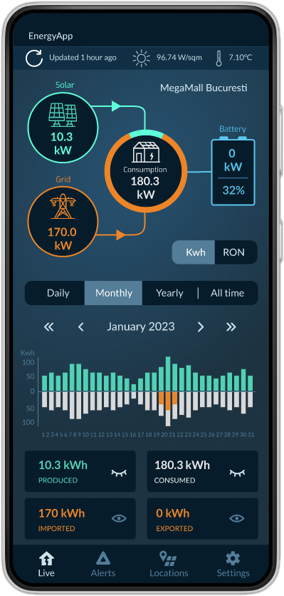
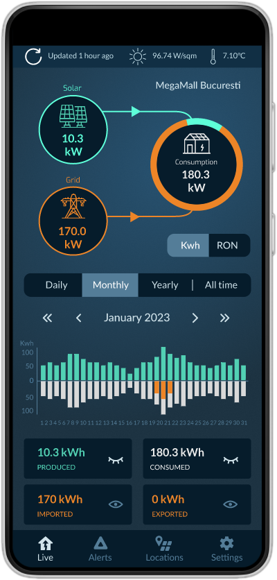
I designed a dashboard as being the main area of the app, with visual representations and color coding for the 3 or 4 possible elements of the system. The Grid, the Solar Panels, the House and, in some cases, the Battery.
The user is mainly interested in how effective the solar system is, so by using a donut pie chart and a scheme of the system, the percentage of green energy - kW - consumed in the house is easily and intuitively visible at a glance. The numbers for each element tell the bigger story.
The main diagram represents a live state, with the flow of energy between elements, at the moment of access. It can be refreshed via a button on the top part of dashboard, where also data about temperature and light at the location are visible.
Using the energy price per unit the dashboard can display all the numbers in their money equivalent, using the kWh/lei conversion button.
The bottom part of the dashboard screen offers the possibility to see the kWh quantities in different relevant amounts of time, so the amount of energy/money that has been consumed, generated by solar, and imported / exported to the grid. A time selector had been designed for ease of use and the graph refreshes itself based on the data from the system.
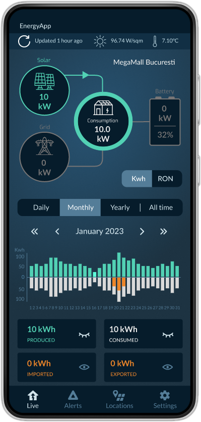

The cases in which one of the elements does not produce / consume energy are treated in a different, neutral color so that the user can instantly make sense of the system's state.
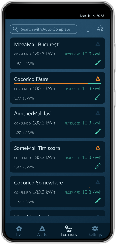
The menu was simplified to offer rapid transition between 4 contexts, the dashboard, the alarms, the locations and the settings areas. I decided to put them all in a bottom navigation tab for ease of use and also because users are familiar with this type of navigation.
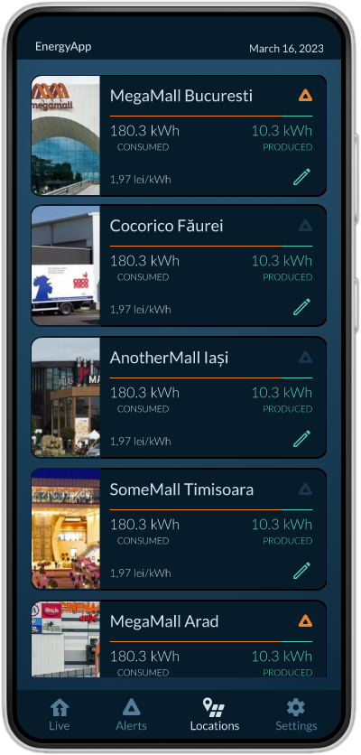
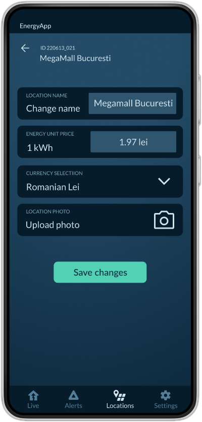
The location list can have two different ways of visualization, one with photos, and one without, each location can be edited, a status button will communicate if there are alerts for the equipment at the location and the donut pie chart is transformed into a bar chart to offer rapid insight into the location status. Also an edit button allows the user to change a few characteristics such as name, photo, energy price unit and currency.

The alerts screen displays a list of alerts from all of the users' monitored locations.
Location ID and place, as well as the equipment that generated the alert and the short label of the alert.
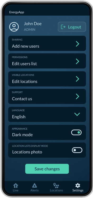
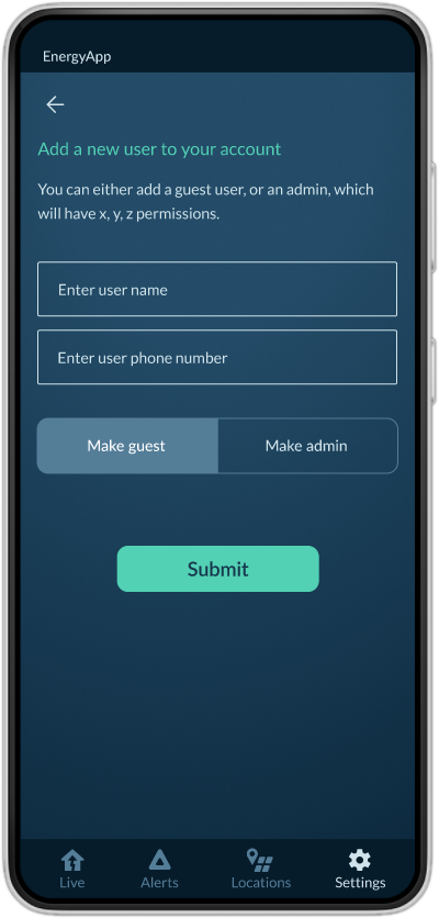
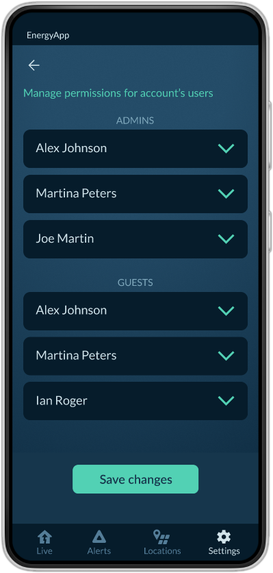
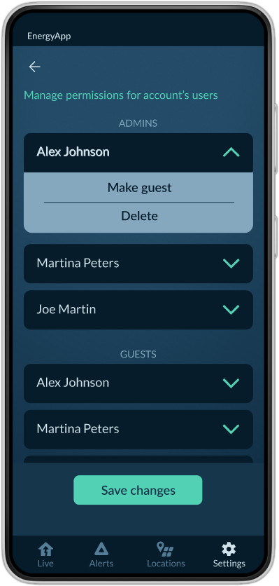
In the settings menu, the user (either an admin or a guest) can access a number of functionalities, based on their status. An admin can add a new user, and either make them an admin or an user. Also, an admin can edit permissions for the users they have added.
The edit location screen contains the most rarely performed operations, such as name changing, photo upload, currency and price per kWh.
A highly rewarding project, I loved creating structure and order out of a big amount of data. In an era of overwhelmingly abundant data, I think clean dashboard design can make a difference between a user who feels lost at the sea of information and a user who feels in control because they can see the important data first, in clear visually structured way and then decide if they need to further look for extra, more specialized information. Order out of chaos, a satisfying goal to aim for.